
Table telemetry
When I first stumbled upon streaming telemetry and gNMI, I thought it was just a better way to gather metrics from network devices. It does that very well, but you can also subscribe to other things, such as tables—and that is quite interesting.
For a long time, I have wanted to build something useful out of it. Bear with me; I will tell you the whole story.
Network devices have state tables: routing tables, ARP tables, LLDP tables, MAC tables, and so on. They hold a certain state at any given moment in time. What if you could collect that data in a very efficient way (ON_CHANGE) and store it in a suitable format to query it like this:
Tell me the state of the table at a specific point in time.
Tell me the difference in the table's state between two timestamps.
If you could do that, you could make assumptions like, “The IPv4 routing table should look exactly the same before and after a maintenance window.” After the maintenance, you can take a look at the dashboard and see if that is true or not. Maybe one route is missing, and you see a red line showing the details. Or maybe another route was added, and you see a green line. Or maybe a next-hop changed, and you see a yellow line.
Well, I did exactly that. Take a look below.
Snapshot view
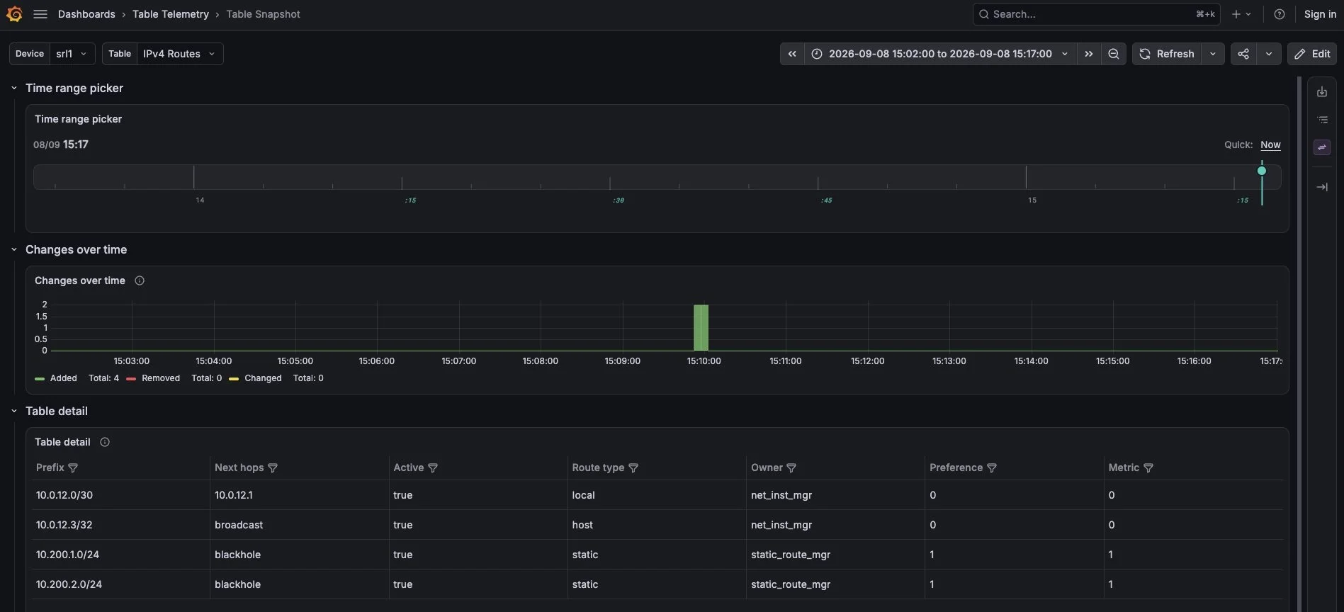
Table telemetry - Routing table snapshot view
I created a new plugin for Grafana to make selecting a time easier. It is called the “Time Range Picker”. Here it is configured in instant mode, which means you only see one marker referring to Grafana’s normal time range end time.
Next, I added this "Changes over time" graph to see the most recent changes in a table within the selected time range.
Finally, I added a table view with filters to see the content of the table. With this view you can troubleshoot afterwards.
Diff view
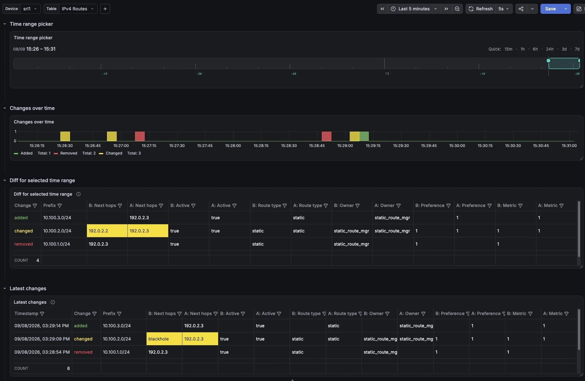
Table telemetry - Routing table diff view
Here “Time Range Picker” is in default mode, which allows you to select time range.
The Diff view shows the “Diff for selected time range” panel. In that panel, you can see the difference in the table's state between the start and end of the time range.
The “Latest Changes” panel, on the other hand, shows every change within the time range. You might wonder what the difference is. Well, let's say a route was added and then deleted within the selected time range. In that case, the Diff panel would be empty, as there is no difference between the start and end timestamps. The Latest Changes panel, however, would show both the addition and the removal of the route.
The “B:” and “A:” in the column headers stand for Before and After. This makes it easy to see what has changed. The modified fields are also highlighted in yellow.
Table agnostic
I made this solution table-agnostic. This means the dashboard doesn’t care whether it is an ARP table, a routing table, or something else, even though their columns are different. This makes it easy to add new tables to the system.
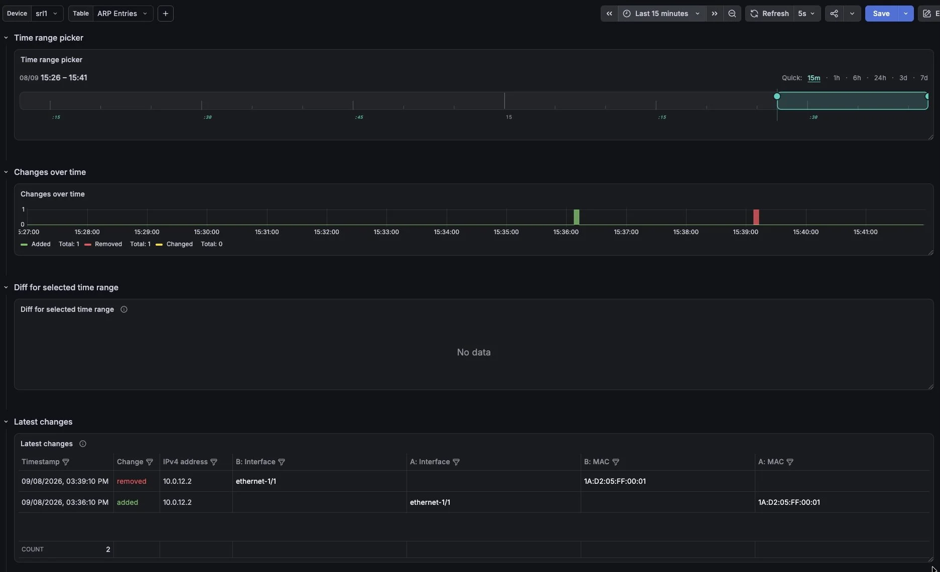
Table telemetry - ARP diff view
Conclusion
I find this solution very useful — what do you think?
